Narrative Data Visualisation with R Shiny Interactive Dashboard

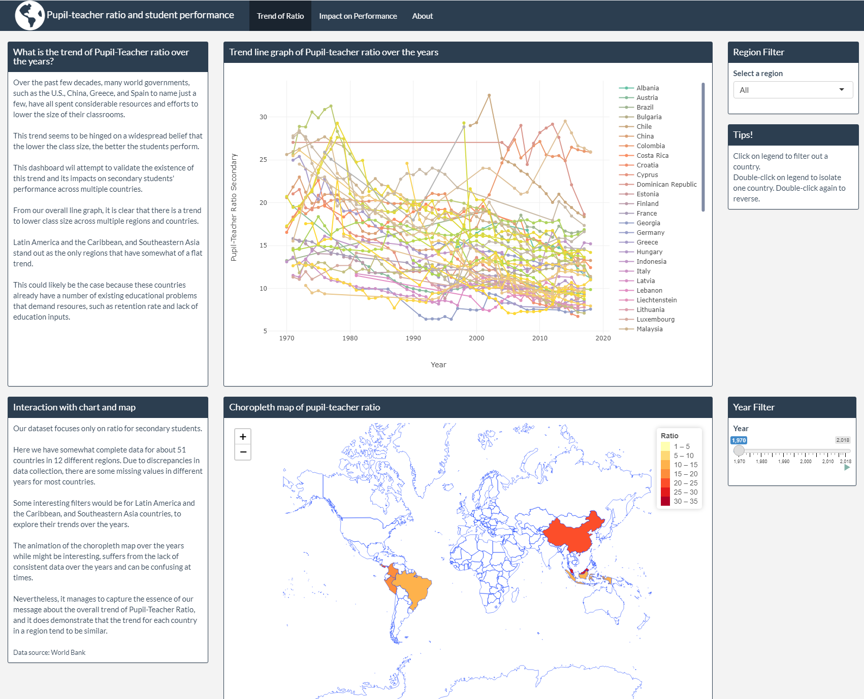
Above is a screen shot of an R Shiny interactive dashboard I made to explore the impact of Pupil-Teacher ratio on student performace around the world.
Idea behind the project
I was reading a book by Malcolm Gladwell called David and Goliath: Underdogs, Misfits, and the Art of Battling Giants, in which he postulates that underdogs are not always at a disadvantage due to other underappreciated advantages they have going for them, and a perceived advantage by conventional standards might not actually be the case.
I came across a story about a private boarding school called Hotchkiss in Connecticut, U.S. It is considered one of the premier private boarding schools, and the tuition is almost $50,000 a year.
Aside from all the best amenities that money could buy (two lakes, two hockey rinks, four telescopes, a golf course, and twelve Steinway pianos), the author specifically draws my attention the fact that the average class size is twelve students.
From all my years going to school and university, I have always had the thought that the lower the class size, the more attention each student will get individually, and hence the better the students there perform. It might be a direct results of all my years in Vietnamese public school system, where a class can have upwards of 50 students (not that I’m complaining, it was super fun 😅).
It just becomes ingrained after you have heard it so many times from parents and policy makers alike.
However, Gladwell argues that this seemingly beneficial and often highly sought after advantage is actually a disadvantage, for a number of reasons.
The main one being that, with too small a class size, there is no diversity in thought and experience and so discussions and conversations often get stuck. Also, a class that is too small might be too intimate and intense for some of the students, effectively shutting them out from engaging. Another might be that there are not enough similar peers for the students in a small class room to identify with and learn from.
Gladwell cites a number of studies and statistics to support his claims, and, I have to say, I love it when my commonsense is challenged with statistics. It actually makes quite a lot of sense.
Why I chose R Shiny
When I read David and Goliath, I was also doing a course into R Shiny, specifically to build interactive dashboards. So, to close out the course and since I was so impressed with the story, I decided to use my newly learned skills and build an interactive dashboard to explore this further on my own, using public datasets that I could find.
Challenges when building
The main challenges I found were data related. Most of the public data sets available for this topic are highly inconsistent and have many missing entries for different countries, due to inconsistencies in reporting.
The student performance metrics I choose to use are the PISA tests, which a number of countries have just started participating recently. Hence, there is fewer data points available for newer countries.
As a result, some of the intended features for the dashboard can have confusing results, specifically the choropleth map animation.
Online showcase of the interactive dashboard
If you are interested in interacting with the dashboard, you can check it out by clicking on this link. It will likely take a few seconds for everything to load.
December 2021 - Melbourne, Victoria.
Thanks for reading! Check out my other projects and blog posts as well if you would like.